By Linda Schmid
Paint and coating colors can seem like secondary considerations in the building process. Yet, they can be important to the client who lives or works in a space every day. Paint and coating manufacturers choose colors of the year that they believe reflect our cultural state of mind, the ideals to which we aspire, an expression of the collective soul if you will. This year’s choices definitely seem a case in point.
After all of the uncertainty of the last couple of years, people seemed to turn to the outdoors looking for comfort and inspiration, hence the masses of people heading to parks of all kinds, not to mention all of the people who took up gardening and back yard projects.
Hence, Azkonobel’s color of the year is Wild Wonder, which they describe as having “a glowing natural tone that connects us to nature and helps us feel better in our homes and in the world around us. It is based on the idea that, as people search for support, connection, inspiration and balance in their lives, they’re diving into the wonders of the natural world to find it. The accompanying color palettes are Forest Hues, Raw Colors, Meadow Brights, and Seashore Tones.
Sherwin Williams’ Redend Point
Sherwin Williams has chosen Redend Point as their color of the year. This earthy tone is warm, subtle and comforting, reminiscent of natural earth-scapes.
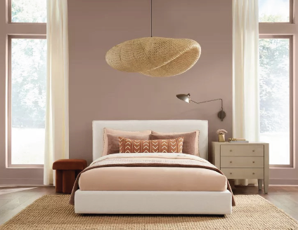
Valspars’ Gentle Violet
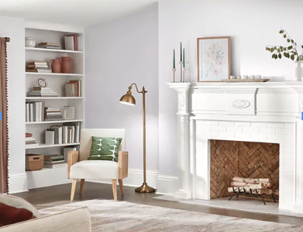
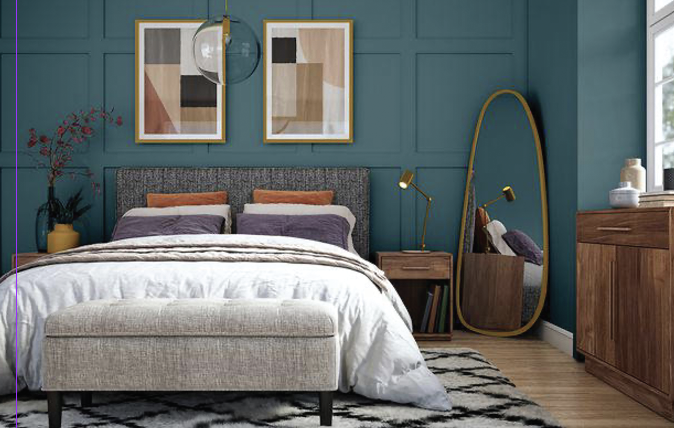
Behr’s Blank Canvas
Gentle Violet is one of Valspar’s colors for 2023, a youthful color that embodies a coming together of natural and synthesized colors for a feeling of harmony and connectivity.
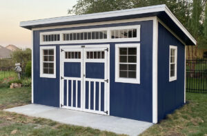
Behr’s Blank Canvas is a warm and inviting neutral color with a lovely palette of colors to complement it.
Terra Rosa is the color chosen by Dunn Edwards. A romantic color that seems to speak to a simpler time, a soul-satisfying experience in a more complicated and changing world.
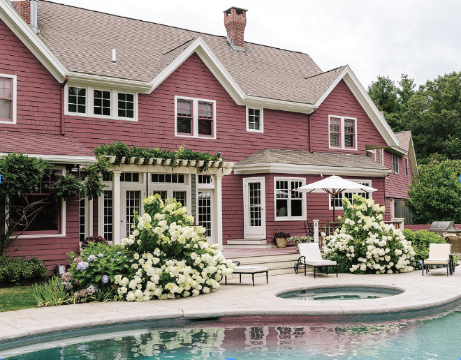
Dunn Edwards’ Terra Rosa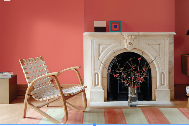
Benjamin Moore’s Raspberry Blush
Benjamin Moore also went with a pink hue, but their color of the year evokes an entirely different feeling. Joyful and lush, Raspberry Blush is pure celebration.
PPG And The Art of Color Trending
PPG lays great emphasis on colors because they have seen that it is important to the people who live and work with the products they develop. The company provides paints and coatings for many different markets including automotive, agricultural, aerospace, consumer products, and of course, construction applications, among others. This vast breadth of markets helps inform each market; no industry performs in a bubble.
When it comes to colors in construction, color is a strong influencer on people’s lives. They will live in these settings every day and there are strong psychological aspects to these colors.
Color experts look not only at micro-trends, or what is popular now and in the next couple of years, they also forecast what is going to be popular in 5 to 10 years, the macro trends. Of course, most of the time people don’t know why one color does nothing for them or why another color seems to resonate with them. They don’t need to; they can just enjoy. However, the color experts could probably explain why, because it’s their job to know why.
Inspiration for PPG’s Color Predictions
They know because they look at what has happened in the recent past to understand what people are looking for today and what they are likely going to be looking for tomorrow. Does that sound a bit esoteric? Let’s take a look at how they came up with their 2023 color forecasts.
They began with what had been happening culturally in the previous decade or so, 2010-2019 and found these themes: recession, reduction, social media, climate, me too, equality, and crypto-currency. Then the psychology of how these things affected people come into play. For example, recession could give people a need for something soothing, yet minimal, while climate concerns could make them yearn for colors from nature that feel stable and comforting or refreshing and inspiring.
The next step was to develop themes from these analyses. They came up with three: Serenity, Origin, and Duality.
Serenity is about disenchantment with a chaotic world and the need for sanctuary and calm. It includes graceful, watery tones and warm neutrals. Think of it as a mental reset to something romantic, ethereal and escapist, or cool and echo friendly. In fact, Vining Ivy, PPG’s Color of the Year, comes from this palette of colors, and is often used as an accent color with warm neutrals.
Origin colors are about a sense of wonder, a balance between the earth and the cosmic. It includes natural and mystical hues, fibrous earth-like materials, and raw, distressed-looking patinas. Much of Origin design looks quite ancient, or alternatively, clean and contemporary like stone and marble.
Duality is a theme full of contrasts. It can be a blending of traditionalism and fantasy, bold and soft, real and “augmented”. It can be quite dramatic – “old school glamor for the modern age” or a playful blend of design through the decades for a new and contemporary creative. One thing is for sure: duality design is anything but boring.
Finally, they looked at visuals that captured the essence and feelings of the themes and they found the colors that bring them to life, developing whole 2023 Color of the Year palettes.
GSCB