When you are building any structure, its size will necessarily add much to the view and landscape, so ensuring it is aesthetically pleasing is a good idea. One of the major factors that all buildings have in common is not just their design, but also their color, which makes a significant difference in how welcome its appearance will be to the eye of the beholder.
Color makes a significant difference in how welcome a shed’s appearance will be to the eye of the beholder. Photo courtesy of Stoltzfus Structures
Whether you are adding a garage, garden shed, shed studio, kennel, or outdoor living structure to a property, there are a few things you should know about the ‘color wheel’ and how color positively or negatively affects both the building’s use and its sense of ‘belonging’ on site.
Unless you are building a structure in a playground, fairground, or other vibrant location it’s best to leave the bright reds, yellows and oranges to the prestige brand Italian automakers. Even if you are lucky enough to own a Ferrari or Lamborghini in one of their unmistakable color schemes, and are building a garage for its safekeeping, it might be best not to add a bright color to the structure. Not only will such a pop of color upset the neighbors, it will not blend into the neighborhood either and almost certainly will not match or complement the color of the house on the property. This is especially important to consider when building a garage, as this useful adjunct to a property is often placed in close proximity to the house for the most efficient daily use.
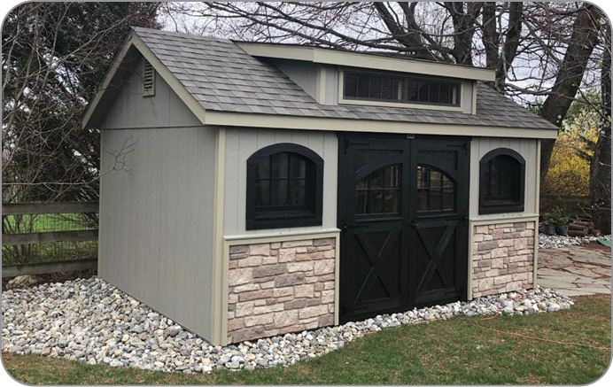
Shingles and faux stone wainscot dress up a monochromatic color scheme with texture. Photo courtesy of Stoltzfus Structures.
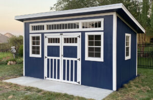
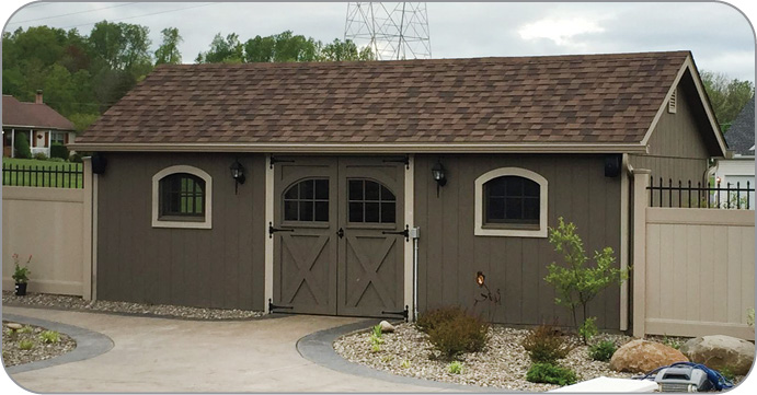
Darker colors make a building warmer. Photo courtesy of Stoltzfus Structures.
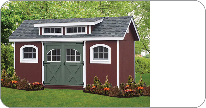
This shed’s color scheme blends in with the neighborhood. Photo courtesy of Stoltzfus Structures
A brightly colored structure placed anywhere on a property can also be extremely off-putting to a prospective buyer should the owner ever need to move. The addition of a garage, shed or other structure will usually provide added value to the property appraisal, but making a new shed or garage a bright ‘fire engine red’ might not encourage a sale.
Bright colors also attract insects such as bees and wasps. When you are designing a wooden structure, any presence of annoying carpenter bees can be easily addressed with an Amish bee trap, which is a simple, eco-friendly method for eradication of those pesky bees. (Note: Carpenter bees are not honeybees and the latter are not drawn to the Amish bee trap.) Buzzing insects can at worst do structural damage and at best be a nightmare to live with so advise your customers to keep those bright colors in the flower bed where they belong.
The closer the new structure is to others the more important it is that the color be similar, the same or complementary to its counterparts. Stoltzfus Structures builds with an array of types of siding, roofing and other materials, including — but not limited to — traditional board and batten with 15-year stain warranties to LP Smartside to match or complement the home.
In some instances the homeowner may want to go to a completely different color palette for their main building. For example, if you are adding a studio shed for a client to the opposite end of their garden, away from their house, and want to create a completely different ambience, the use of another color can help differentiate the space and define it as a place of relaxation or revelry.
The color wheel is a great tool to teach about the use of color for the best advantage depending on individual taste and ultimate use of the structure. Invented in 1666 by Isaac Newton, the wheel incorporates color combinations that showcase which colors harmonize or complement each other. The rules of color theory are especially important to understand if you plan to customize a structure with one color for siding and a different color for the trim, or if you want to break up the height of a tall wall, e.g. on a tall Gambrel garage, by making the first few feet off ground level one color and the section above another.
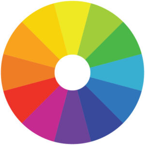
Complementary colors appear opposite each other on the color wheel. If using a monochromatic color scheme, use three shades of the same color.
It is not as complicated to use as you might think at first glance. Complementary colors are those found on opposite sides of the wheel. If your client likes high impact color combinations, then this will work for them. On the other hand, if the owner wants a more harmonious appearance, then stick with the monochromatic combination and use three shades, tints and tones of one base color.
There are other rules of color theory: triadic (three colors evenly spaced on the wheel); analogous use (three colors that are next to each other on the wheel are used); tetradic (four colors evenly space on the wheel). However, these options are not particularly useful (i.e. should be approached with caution) for a construction project as they may quickly overwhelm the viewer and can be jarring to the eye.
Regional Location Matters
The regional climate may be one of temperature extremes. Hot weather environments are best addressed with cooler colors such as white and grey. These lighter colors will reflect heat and provide a cooler interior environment and they also project the feeling or more size and space. If the same building is painted black versus white, the latter will always appear larger in stature.
And in reverse, the darker colors such as black and dark blue will absorb the heat and make the building warmer.
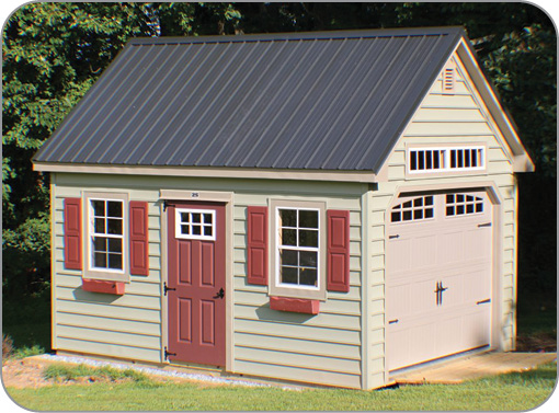
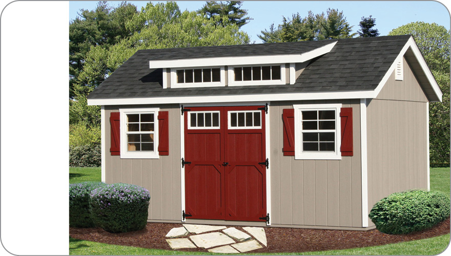
A neutral wall color makes this shed fit in well with its surroundings, while the “pop” of color on the door and shutters adds to the shed’s visual interest.
Photo courtesy of Stoltzfus Structures.
Aesthetic Appeal
If the owner wants their new structure to appear more grounded in the landscape, then go with earthy colors and neutrals such as browns, grays and dark greens.
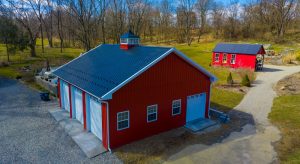
For a rural feel, the traditional red color of cow barns and farm outbuildings is a popular choice. Originally this rusty red brown color was purposed in Scandinavia to create the appearance of red brick, which was considered a building material of the wealthy. The European farmers that settled in the United States adopted the same color and made their red paint mixture from lime, red iron oxide (otherwise known as rust) and skimmed milk.
The idea was to protect the raw lumber from insect damage and deterioration caused by Mother Nature’s fierce weather. Some innovative mind then came up with the notion to add linseed oil to the mixture. A bright idea as it transformed the coating into a product that could actually soak into the wood and thus further protect it. Today many outdoor structures and outbuildings are still painted in this color that has become traditional.
Remember: Whatever colors are chosen, the decision is one that will likely have to be lived with for a long time. Help your customers choose wisely. GCSB